
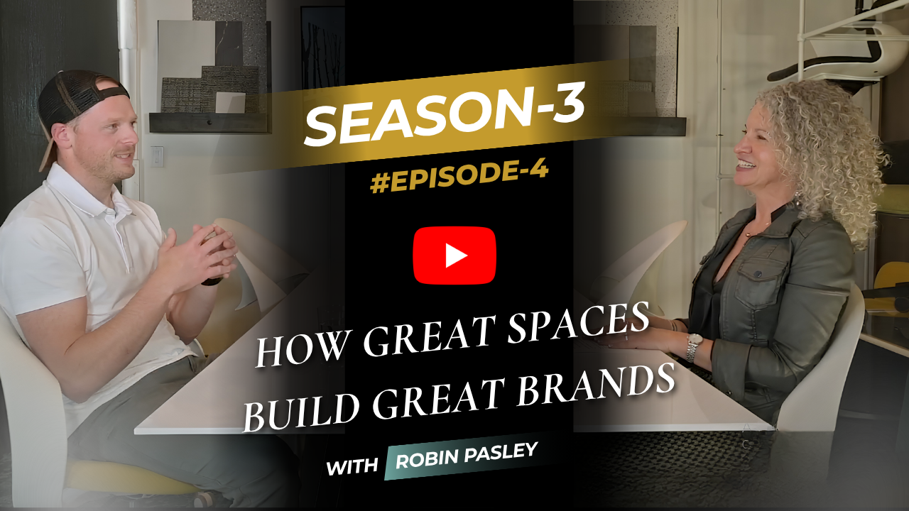
Color psychology in commercial interior design is one of the most direct tools business owners have for shaping how clients and staff feel the moment they walk through the door. In this episode, NCIDQ-certified commercial interior designer Robin Pasley breaks down the emotional messaging embedded in color, explains how trauma-informed design uses specific palettes to support people who have experienced trauma, and shows how a well-built brand palette can be woven into a space through value, hue, and balance. The practical takeaway: choosing color intentionally — not just aesthetically — is how business owners use their space as a strategic growth tool.
Randi Lynn Johnson: In talking about how important comfort is in a professional space, we hit chairs and ergonomics. That's a fun word. Let's get into color a little bit. Robin, can you tell me why so many places paint their hallways taupe?
Robin Pasley: That's a really good question. Taupe is a great color because it sits in between tan and gray. It's been a really useful color as we've tried to leave the gray season behind and enter the season of browns, tans, and all the cream colors. If you didn't take time to upgrade in the last 20 years, you're right on time.
Randi Lynn Johnson: I always thought that was grayish.
Robin Pasley: Yeah. So the idea of color being a part of creating comfort in a space is super important, because color in itself has messaging attached to it. Just hitting the high points on that: if you want a space to feel intense, you can put really bright reds and oranges — that will make a space feel intense. A space with a pastel blue, though, is going to feel very calming. As a matter of fact, when we do trauma-informed design, we have to use colors that have a calming effect, so we're almost always working in a pastel palette — especially pastels in the greens and blues, because they make you feel more calm and rested. You see those a lot in spas as well.
Randi Lynn Johnson: So you said trauma-informed design. Can you explain a little bit more about what that means?
Robin Pasley: Yes. Trauma-informed design is design that is specifically focused around people who have experienced trauma. For instance, I did a permanent supportive housing shelter where the majority of people using that shelter had experienced trauma. We wanted the space to address as much as we could to help them feel more calm and comfortable. Even wayfinding — there's data showing that if someone is being triggered in a space, their ability just to find their way back to where their room is becomes critically important. We used color as a major tool: we would change the color per floor so that if someone got off the elevator and knew their color was yellow, they were home. They could find their place.
That's an extreme application, but every business owner needs to think about who their end user is, who their clientele is, and what kind of color treatment would best serve their space.
Robin Pasley: But then there's another side to color that's definitely part of spatial branding — and that's the idea of connecting the colors in your space to your brand. A well-formed brand palette is going to have more than just the colors of the logo. There will usually be a secondary set of colors, and sometimes even a tertiary set, and I find that dipping into those to bring color into a space is really important. That way you're not just repeating the logo colors — you're touching on the secondary palette and bringing some of that into the space, which a great graphic designer or brand designer will have already thought through.
So bringing some of that color into the space is super important. A very easy way to do that is one accent wall or a couple of accent walls. But there are also other ways to bring color in through wallpapers and branded features, and I like to use paint designs on the wall instead of just painting an accent color — sometimes that helps break up a space beautifully.
Randi Lynn Johnson: Okay, so I'm hearing two important prongs here. We have to be aware that color evokes emotion and affects how we feel — so as business owners, you've got to know it's affecting both clients and staff. And color should also coincide with our branding, because we have that one great chance to make a good first impression. Is there anything else you find helpful when talking about color and making a space comfortable?
Robin Pasley: Yes, this is going to be a little nerdy, but the other things to think about with color are hue and value. Hue is the actual color itself — it's what your brain knows as the difference between red and yellow. Value is the intensity of that color in what you're looking at. To define that better: pink is a mixture of the hue red with white. So when we're thinking about how much intensity of color to bring into a space, even if your brand has blue and red in it, you may not want a red wall behind your desk because that's a really intense color that may bring an emotion you don't want in that space. It's about understanding how to bring in the hue at the right value so you're not overwhelming the space with too much color.
Robin Pasley: Another thing to keep in mind is color balance. Our eyes pick up the opposite color on the color wheel from what we're looking at. When you're looking at yellow, your eye will feel comfortable if it can also see purple and some blues. Same thing with reds and greens — your eye likes to see those together. You have to think about color in terms of balance as well. Having warms and cools together is important because it works the same way: your eye wants to see warm and cool together. If you have a palette that's all warm, it's going to feel uncomfortable and you won't know why.
Randi Lynn Johnson: Yeah, it's just like something's missing.
Robin Pasley: Right. And in the last 15 years or so, everybody was just doing everything in hues of gray, and you would walk into a space and wonder why you felt so cold. It wasn't just because they used gray — it's because they used gray with no warmth. It needed balance. Our brains want to see balance. Even if you like things to be skewed or out of proportion, your brain still wants to see balance.
Randi Lynn Johnson: In an increasingly competitive market, the merits of using interior design as a strategic growth tool can make all the difference in not just surviving but thriving.
Robin Pasley: Pasley Commercial Interiors — design to help your business grow.
Recorded in our studio at 616 N. Tejon St., Colorado Springs, Colorado 80903
PASLEY COMMERCIAL INTERIORS is Colorado's trusted partner for growth-focused commercial interior design. As a woman-owned, NCIDQ-certified firm based in Colorado Springs, we blend spatial branding, client experience design, and turnkey interior solutions that help businesses make powerful first impressions and win their ideal clients. Our direct-to-manufacturer dealership simplifies the commercial furniture procurement process — reducing costs, cutting lead times, and delivering measurable ROI for every client. With deep expertise in workspace strategy, branded environment design, and commercial space planning, we transform business identities into client-converting spaces that inspire loyalty and drive revenue. From boutique and medical aesthetics buildouts to hospitality, multi-family, and franchise commercial projects, PASLEY COMMERCIAL INTERIORS delivers both impactful aesthetics and bottom-line results — because your space should work as hard as you do.
H.B. Pasley, Branding & Business Growth Advisor
616 N Tejon St
Colorado Springs, CO 80903
To request our complete Press Kit, call or schedule a conversation via our Contact Page.




.avif)
